Nexa
Brief Source: @designerbriefs via Instagram Branding Description: Noah Baldwin
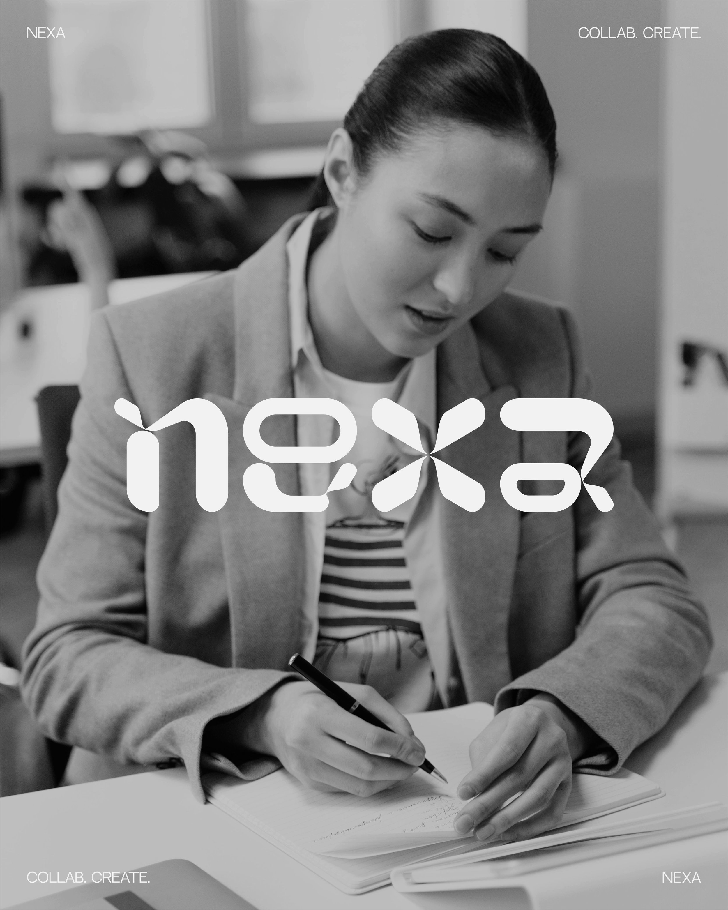
Collaboration and creativity thrive at Nexa — a modern co-working space and coffee bar for professionals, entrepreneurs, and freelancers.
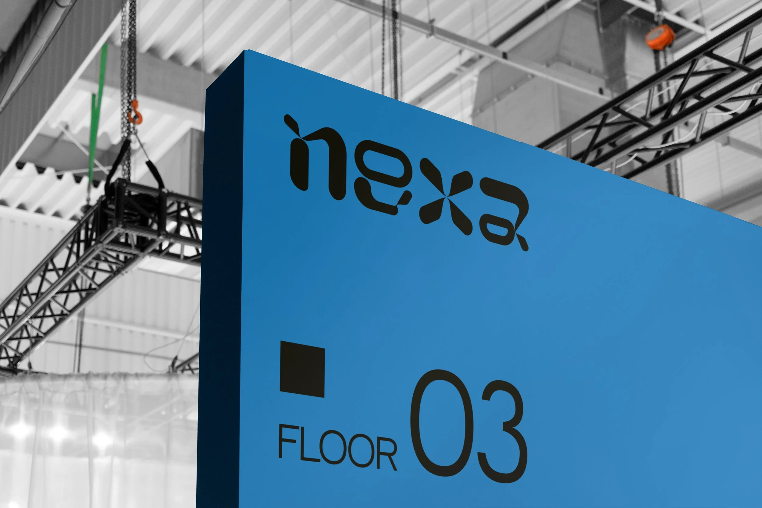
Crafted from a custom typeface, Nexa’s wordmark projects an air of precision and distinction at first glance, accentuating the company’s cutting-edge facilities and contemporary flair. When examined closer, rounded edges and fluid forms become increasingly pronounced, evoking a sense of connection indicative of the brand’s community-centered core values. The color palette takes inspiration from the CMYK model used in color printing — another nod to technological advancement and Nexa’s forward-thinking mindset. Supporting the brand’s visual identity, clean whitespace, dynamic composition, and a complimentary sans-serif typeface provide captivating style to Nexa’s digital, print, and packaging assets.


