Aki
Brief Source: @modernbrief via Instagram Branding Description: Noah Baldwin Winner of Modern Brief’s International Design Challenge*
A new, modern coffee café, Aki offers irresistible brews and unmistakable style.
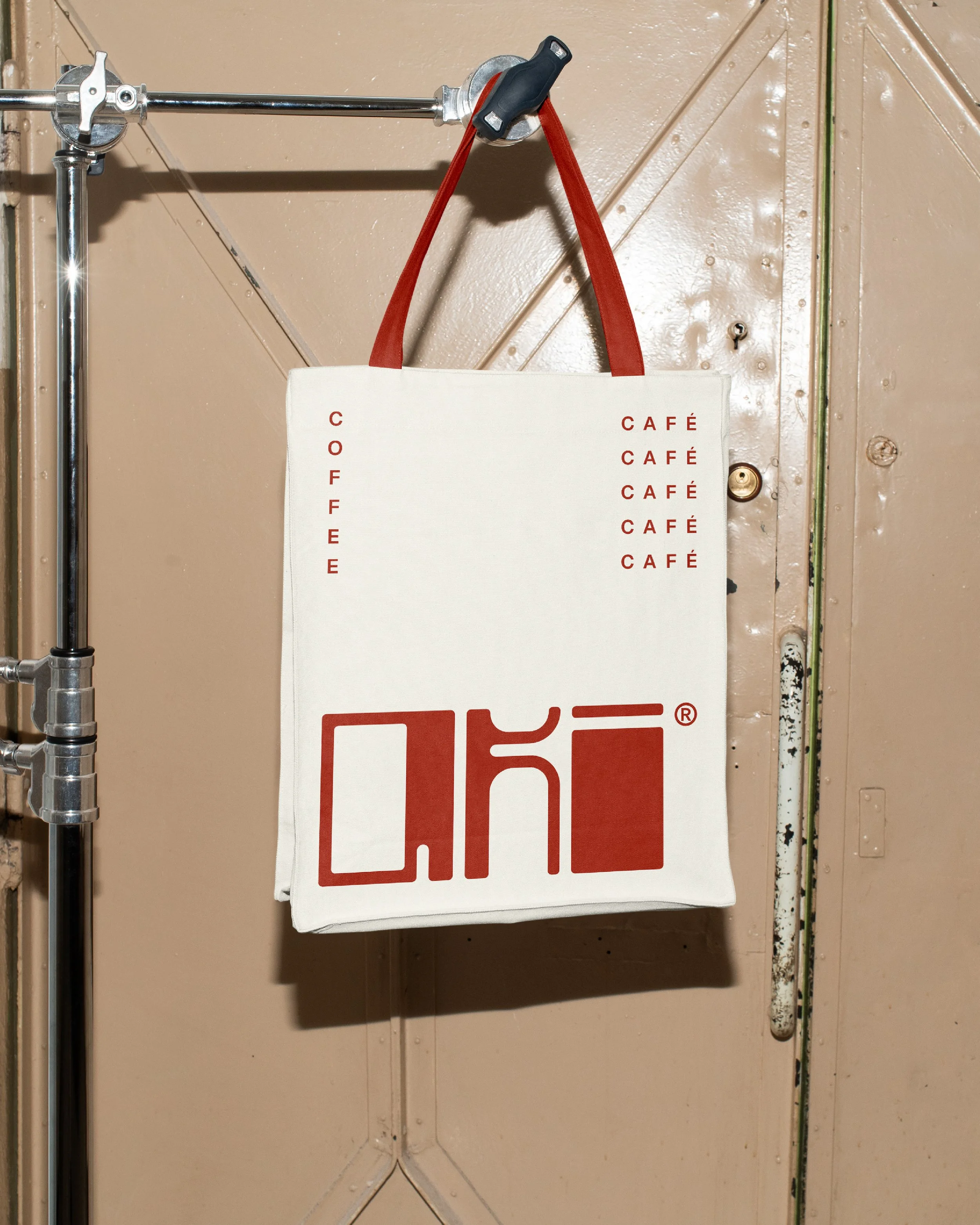
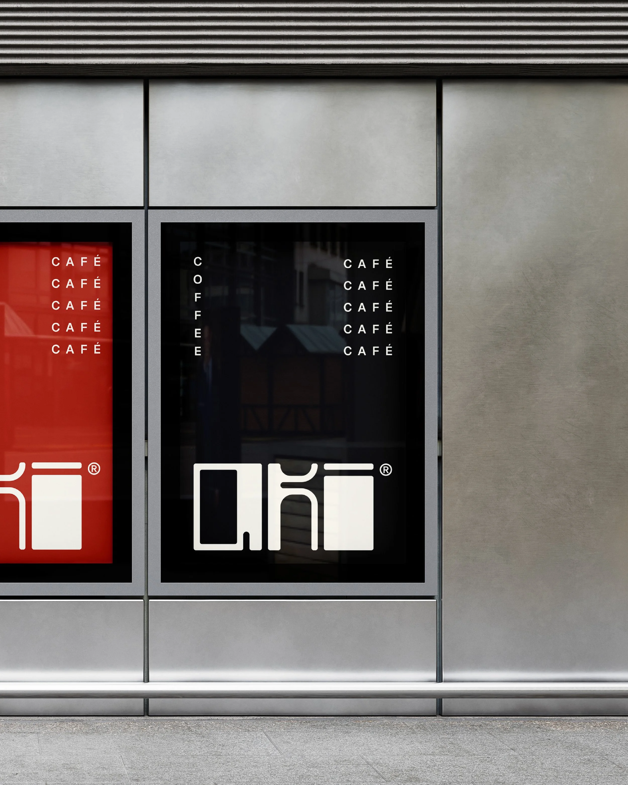
The brand’s primary wordmark takes inspiration from the artful mechanics and geometric form of contemporary espresso machines. Found throughout the café’s overarching visual identity, three foundational descriptors of this technological reference point are explored: precision, sleekness, and distinction.
Precision: The custom wordmark showcases a monospaced configuration and balanced appearance, signifying Aki’s attention to detail and dedication to consistency.
Sleekness: Found throughout the logo suite and brand pattern, rounded edges and smooth line work provide a sleek visual texture indicative of the brand’s modernistic persona and forward thinking approach to coffee creation.
Distinction: Aki’s signature red grabs attention, elevating adverts and collateral while symbolizing the café’s stand-out range of coffee flavor profiles.
*This design was selected and featured by the Modern Brief panel on Instagram. Click here to view Instagram post


