The Maple Stack
Brief Source: @briefclub via Instagram Branding Description: Noah Baldwin
For those seeking a heightened casual dining experience complete with the freshest breakfast and style, look no further than The Maple Stack.
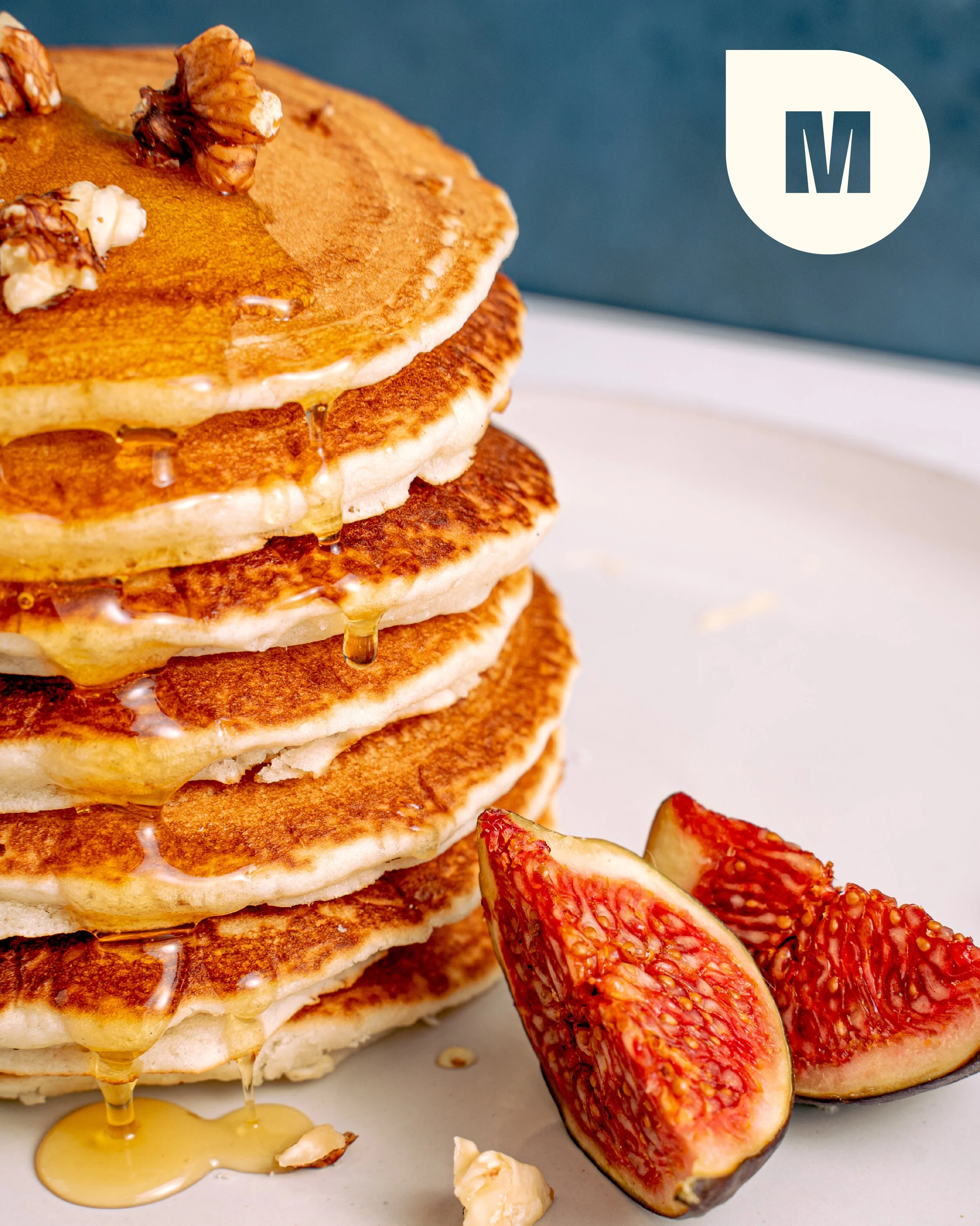
Vintage charm elevated by a contemporary boldness characterizes this lively new pancake house. A fresh take on the hues commonly found in classic American diners, the brand’s color palette encapsulates the warmth, inviting atmosphere, and nostalgia central to these hometown eateries. Mid-century modern influences are subtly elevated in the logotype and logomark by way of a minimalistic, yet impactful typeface. The brand pattern also possesses an updated 1950s flair, fusing striking geometric shapes and dynamic visual rhythm brought to life by the logo suite and slogan. As demonstrated on the packaging and in print advertising, The Maple Stack’s pronounced visual identity doesn’t compromise versatility and congeniality, making it appealing to a range of audiences aiming to satisfy their pancake cravings.


